Thursday, December 17, 2009

Cute Creatures that have a Mind of their own

Gizmo from "Gremlins"


Teddy from A.I Artificial Intelligence


Stitch from "Lilo and Stitch"
I remember when I first seen the movie Gremlins, I remember the cute little furry alien Gizmo and how much I wanted him. He was so cute and fluffy looking. Although I was too young to remember, from what I heard everyone wanted a Gizmo, minus the little Gremlin creatures. Although there have toys that are replicas or other little furry toys that are similar, it is still not the same. Robotic toys or stuff animals are only capable of saying and doing a limited amount of things. They are only able of doing as much as they are programmed to do. This can get pretty boring after a couple of months. It still is nothing like the real thing, which is something that can think for itself and has feelings. It’s kind of like having a pet but one that can actually talk to you and looks sweet, innocent, and cute. If something like this was really invented whether it be a robot or some sort of creature, it would be neat, but at the same time scary as well. Something that was not created naturally but has emotions and can think for itself is a scary idea. Although it may be interesting, who knows what could come from this type of creation. The thought of having a little Mugwai or cute furry creatures that you can interact with about anything and everything seems fun. However, it may not always be, just like interacting with a human may not always be fun.

Selling your Soul in the Business of Entertainment

When I was browsing the internet for an artist, looking through pictures I came across a picture of that artist dead body autopsy. It was very horrific because that was something I was not planning on seeing so it was quite disturbing. It just was not like that for this particular celebrity; it was like that for many others as well who had past. Clearly these photographs were leaked from someone who had access to their bodies. The thought of taking a picture or stealing a photo of someone just so it could be leaked onto the internet is very disturbing to me. I know that it is all because of the money factor, people are given a lot of money for doing corrupt things like that. I know I could never do anything like that because I would never be able to forgive myself. Stealing pictures of a dead body just for money a person would have to remember that that was someone’s child/mother/father/brother/sister. In the entertainment business you have to learn not to sale yourself just for the purpose of getting money in your pocket. Having values and morals are always important to remember and carry within a workplace because it is easy to forget. I think that being true to yourself and not changing morals or values just for money purposes is a really important belief to have because there will always be temptations of scheming and corruptions.

Sony Apple Remote


Sony has yet to release their Apple Remotes. It is a remote control for the television but it detects motion. With just a swipe of the wrist you could change your channels, turn up and down the volume, as well as other things. The cool thing about this remote is that it actually resembles an apple. There are about four apples and it sits on top of this white plate which has a very clean look. The whole display is nice enough to sit as a display on a table. I think that this product will be successful based on its overall look. The color is a striking green and it has a nice sleek and modern look to it. It looks like a sophisticated version of toy is the best way I could describe it. It is something that would look appealing to a child as well as an adult. I would even buy one for myself because it looks pretty neat. Sony did a very good job in thinking of an overall look of this product because it would appeal to everyone. It is has a very modern and expensive look the way technology is suppose to have. It also has a bright and interesting look to it, and that is what a toy is supposed to have.


Mp3 Player and Cosmetic Device


Barbie is surely thinking ahead of other companies with their digital Mp3 that turns into a cosmetic device as well. It holds a 3GB memory and allows you to store photos. The Mp3 player opens up as a compact with a mirror at the top and it also is a necklace to attach to anything. Many companies have combined phone with an Mp3 player, but I have not really hear d of anything other than that. This digital device is very interesting because the idea of combining things together that are not similar is very cool. It is difficult to come up with an invention and have it actually be successful. For instance, using sunglasses and a digital camera all in one can be used as an idea. The idea sounds pretty cool but how exactly will this device look and feel. Will it have the sleek and stylish look that sunglasses are suppose to have? What about the overall feel of the sunglasses device? Will it be heavy or light weight? When creating something that someone is suppose to wear, all features have to come into play when designing something.

Barbie Digital Nail Salon


I had seen on the internet that Barbie has her own nail salon for girls. It is called Barbie Digital Nail Printer and it allows girls to get a manicure at home instead of going to a salon. It works by connecting to your computer, and users can choose over 1000 different designs and once selected, you stick your nails under the printer, and it prints directly over your nail bed. I think that this is a very successful idea because children, especially little girls want to do the same exact things that grownups want. As a little girl I remember I always wanted my nails painted with different colors but I was never allowed to go to the nail salon. However, this product is meant simply for young girls that are appropriate and stylish. Going to the nail salon it could cost about $15 just to get your nails painted. That is a lot of money for something that does not last. A “do it yourself” nail salon is a very creative invention for children; however it would be an even more successful one for adults. So many women line up in nail salon shops just to get a design, shape up, or fill-in. Sometimes people do not feel like waiting inside of a nail salon or get sick of all those different smells. Creating a “do it yourself” for adults that is similar to the Barbie Digital Nail Printer would be a very good idea.

Wednesday, December 16, 2009

Future Outlook of Availability of Movies

In the near future I heard that movies will no longer just be released in movie theaters but in our own homes as well. People will no longer have to travel to a movie theater to see a movie but watch it in the own comfort of their homes for the same price. Although it is more convenient, I do not really like this idea. I think that this takes away the essence and tradition that has been around for decades of going to theaters to see a movie. Going to the movie theaters has been known as an activity for families, friends, or couples, to come together and enjoy a day of entertainment from a new movie. It gets people out the house and brings the public together to enjoy a good movie. Being in a movie theater immerses viewers into what is playing with the surround sound and huge screen in front. Although the style of movie theaters has changed, it is still the same traditional settings. People come in pay for a ticket of their choice, purchase snacks from the concession stands, take a seat in the comfortable chairs, and stare ahead awaiting the picture on the vast screen. Movie theaters have always been a big part of the entertainment culture and it offers something that watching a movie at home does not.

Consequences of Technological Inventions

There are so many movies out that are based on the creation of technologies and the destruction it causes the world such as Eagle Eye and I Robot, but the biggest one till this day is Terminator. These films and others that are similar to this plot represent the discoveries and inventions of technology that all lead to the destruction of the world. Once, humans start tampering with technology and they create something that they could never keep contained and the technologies being created start to take over. With exciting action packed, suspenseful plots that these movies have, we can’t help but wonder if these fiction based plots could actually become a reality. Many things that are shown through movies with the creation of robots as machines to do the job that humans were once used for are actually being done today. The only thing we have not seen is the destruction that machines can cause on this Earth. However, that does not mean it could never happen. I am not saying that a scenario like Terminator could actually happen, however if we tamper with things that we really do not know much about, we may not truly consider the effects it may cause. I think that the government and scientist should watch the things they do because inventions such as time travel and robots that think and work like humans, may have consequences that we just may not be able to handle.

The Eiteljorg Museum

Last year I went to visit the Eiteljorg Museum downtown which contains American Indian and Western Art. I thought that the museum was very educational and interesting. It had a lot of cultural elements such as biographies, stories, facts, photographs, pottery, clothes, jewelry, and tools that was a part of the Native American heritage. I did a little research on the Eiteljorg Museum and I noticed that the museum opened in 1989. It was interesting to me that when I was a child; the schools I attended had never taken a field trip there. I thought that this museum would make a perfect trip for students from grades 7 and up. Visiting the museum really gave me a true insight into the Native American culture verses just reading about it in a history book. I think that this museum would appeal to students because you get a better understanding of Native American culture as a whole and the items in the museum are very interesting. Native Americans were very insightful and creative and you see that within the museum. I think that schools should take field trips to the Eiteljorg Museum because it gives you the experience of another culture. As diverse as the United States is now, we have to be diverse in the knowledge of our culture as well as others. A textbook does no justice as oppose to actually going to see artifacts and the real images of another culture.


Website: http://www.eiteljorg.org/default.asp

Effects of Subliminal Messages


I was reading an article about subliminal messages in Disney movies and it was quite funny. The definition of subliminal messages is, visual or audible messages shown in a way that prevents the conscious mind from recognizing them. http://www.google.com/url?q=http://www.religioustolerance.org/gl_s1.htm&ei=ZFgoS4_0H5GMNvzB7IsM&sa=X&oi=define&ct=&cd=1&ved=0CAcQpAMoAg&usg=AFQjCNEwt91pt2r2YDQoULfEN_Xfla34vQ. These messages can be hidden through a film, on CD’s, or tapes. Subliminal messages have even been in some of the classic films such as, The Rescuers, The Little Mermaid, and The Lion King. The Subliminal messages hidden into the film are actually sexual messages which are either words, pictures, or a something said into the film. For example in Aladdin, it is said that one of the characters whispers, “Good teenagers take their clothes off.” On the cover of The Little Mermaid, there is a shaft of a penis that is part of the castle. In a scene in the movie The Rescuers, there is a naked woman in the background. In a scene in The Lion King, the word sex appears in the sky. Sexual subliminal messages are said to rise up ratings in viewing and ever since Disney has been running, the movies have always been successful. The directors, writers, and employees, responsible for the obscene messages were fired. This goes to show that when you are in the workforce and u try to be successful by scheming customers, it will probably come back to bite you. I am pretty sure the whole Disney Company was responsible for these doings but to save themselves, they just fired people that created the messages. Taking risk to gain company popularity and money may not have sacrificed Disney itself, but it sacrificed many jobs of employees.


Tuesday, December 15, 2009

Talent People Show in Design

While browsing on Facebook I was shocked to see how many people have a talent in web design, graphic design, Photoshop, photography, and many other design interfaces. Some individuals had either taken courses in these design programs, learned them through tutorials, or they taught themselves how to do it. The amazing thing is that most of these people do them just for fun and as a hobby. This just shows how much creativity certain people have that they may not realize they could easily get a job with. If I were a manager of a company I would probably surf the internet for skills of these certain types of individual and see if they are qualified. Today in society people use the internet now to express themselves and show off their skills. A person can make a design portfolio just by adding work that they have done on their own time. Being able to teach and direct your own work and have it be successful is what true talent is. Many students cannot even perform or create something without having guidelines or instructions for every little thing from someone else. Being able to create something free form or taking direction after a project has been given takes a lot of work. If it is done successfully then that is a great accomplishment and it shows true talent.

Taking Advantage of Online Tutorials

There are so many tutorials for many graphic design programs that teach people how to use the software. I was looking on YouTube and there are many videos available that are easy to follow and quite educating. About any program you can think of was available online, such as Photoshop, InDesign, Illustrator, Dreamweaver, Flash, and Fireworks. For each video there were countless numbers that were available online that teach about anything you would like to know. The videos show you step by step instructions on how to create, fix, or enhance something through these programs. I think that having these programs available for free online, it should be taken advantage of. In class we learn a certain extent of information on these types of programs; but it is up to us to go above and beyond what we have learned. If we are really passionate about learning the crafts of design then we have to take time outside of class to learn much more. In class instructors will only supply us with the beginning tools. With the availability of tutorial videos online, there is no excuse as to why we should not self-educate to enhance our own design skills.

Monday, December 14, 2009

A Graphic Design


This design is a really cool design to me because of the overall look of it. The creator used it as a design for a header in a website. This design was done in a program called Cinema 4D and Photoshop. This design caught my eye because I am a big fan of Photoshop. I just began working with Photoshop this semester and I must say that I am a true amateur of the program. Cinema 4D, I haven’t even used before. Designs like this just remind of the neat and creative things you can do with programs like these. Although I really do not know what this design is suppose to be of besides the different continents, it is still very pleasing to the eye. Being able to create something that may not have a clear meaning but is pleasing to the eye is a successful design to me because people are going to notice it anyways. That is the beauty about designs as opposed to other forms of information such as writing. A design can be about anything and look like anything and does not have to make sense at all. Contrary to what designers may want you to think of their design, designs are meant to be interpreted however the viewer wants. Some designs are just interpreted as a form of beauty and this design is an example.
Image Source:http://www.latentstrength.com/

Good/Bad Web Design

This is a screen shot of a website design made for a coffee retailer. This image was made in Photoshop, Flash, Cinema 4D, and Fireworks. I think that this web design has a very good layout because all of the visual elements are present. There is visual hierarchy with the different fonts used and colors to distinguish the headings. The color usage of the browns, olds, and reds go with the theme of coffee so that it is not confusing. The navigation and links to the other web pages are clear and set off to the side. The page is very clean and sleek looking. It kind of has a soft, subtle, and cozy feel to the site. This also adds to one of the feelings coffee can give someone. The coffee product is called Crown Coffee and it is included into the photo. The total look of the web design sets off the name of Crown Coffee because everything looks elegant and has a royal look to it. The only thing I would change in this design is the long paragraphs that are on the page. I’m not too sure if this is the home page or maybe the about. Regardless, this is way too much information to be piled onto one page. I think that the information about the product could be written in fewer words just touching on the main points being made. Even though all of the information on the right side of the page, I do feel that it is balanced out because there are graphic designs to the left. I would still change the amount of information to keep the viewer’s interest and only share the main points so it won’t look like they are reading a paper.

Image Source:http://www.latentstrength.com/

Sunday, December 13, 2009

The Princess and the Frog Controversy


Disney films released the new movie, The Princess and the Frog this past weekend and there was a lot of controversy. This was the first time Disney has ever made a movie about a black princess so of course there was going to be positive and negative takes on the movie. Some people think that the movie was stereotypical. For example the movie took place in New Orleans, Louisiana. It had voodoo magic incorporated into the film as well as a sidekick alligator. Basically viewers thought there elements of racism and stereotyping in the film. I watched the movie this weekend and I thought that it was beautifully made. The storyline, characters, settings, and layout worked wonderful together. The film was fun from start to finish and each character served a purpose and was very entertaining. It was a really heartfelt and encouraging film. Yes there was voodoo and a sidekick alligator; however it all fit within the storyline. The Princess and the Frog so called stereotyping is no different than any other Disney movie. In Aladdin, the sidekick was a genie. In Mulan the sidekick was a dragon. There is also magic and wizards in many Disney movies, such as the Little Mermaid and Hercules. Although it took many years for Disney to come out with a film based on African Americans I think that they did a good job on the execution of the overall film. I think that there should be more diverse films made by Disney. This is a diverse country and world we live in, and every face needs to be noteworthy. I noticed many things about the film that has not been any other Disney film before. The film was very diverse and each character added something special to the film and that is what the United States is supposed to be as a whole.

Thursday, December 3, 2009

Simple Yet Creative Technology Ad


This is an ad for the Apple IPod Touch and this is an example of a successful design that does not really need that many words or commentary to explain what it is about. The ad shows a photograph of three girls and in the middle is a fingerprint. The message of this ad is quite clear. It’s a digital device that allows you to interact with it with just a touch. Images and ads like this are very interesting to me because using little to no words and still getting the message across is more creative than a bunch of words explaining something. With the finger print, it lets the user know that they can interact with the device. Our human nature is to use our sense of touch to identify or distinguish something. They have illustrated just that in the ad to attract people to buy this IPod. In our metaphoric assignment I had a hard time on m slides of getting the message across without telling what each image was actually representing. Sometimes when I think of complex ideas and I execute them my design can be unclear. This example of the Apple IPod Touch is very simplistic but still eye catching. This shows that simple is not always a bad thing. The creators executed this design ad so that it is discrete and subtle. This ad is quite clever because of its simplicity and creativity.

Image Source:http://www.hongkiat.com/blog/28-nice-and-creative-tech-advertisements/

Tuesday, December 1, 2009

RCA Headphones Ad


This is an ad for RCA and it is pretty cool ad for an mp3 player. It is a picture of an enlarged ear and inside the tip of the ear is an orchestra playing. The message that is being conveyed is that the mp3 player sound quality is so good that it makes the music so clear as if it is being played live right in your ear. Even though the actual RCA mp3 player is very small and placed at the bottom the message is very clear. Once you see the orchestra in the persons ears the first thing you think of are headphones. Then because the ear and the orchestra are both a manila color, you eyes are led to the bright red RCA symbol and the mp3 player with the headphones to the right. I really like this ad because it has a sort of softness feeling to it and orchestra music has a soft light tone to it. The illustration of the orchestra inside the ear, explain what is being represented. Unlike other ads which show a large picture of the mp3 player or IPod itself, the RCA mp3 player is pictured very small. However, at the same time it could be a disadvantage for this ad competing with Apple IPod commercials and ads, they are straight forward and in your face when promoting their product. They are also usually bright in color and flashy; however this ad is more discrete and soft. It may not catch everyone’s attention especially with the type of music being played. I think that this ad would attract an older audience. Maybe if they had a rock band or something more exciting and better usage of color, it would be geared more towards a younger crowd. Also younger crowds like to see products up close so that they know exactly the screen size and applications available. The target audience for this ad is older adults or senior citizens.

Sony Ad


This is an ad for Sony Labtops and it is very interesting. It has a very strange, sleek, and futuristic look to it. The first thing you look at is the shirtless man with the purple pants and heels because the purple is so bright, shiny, and striking. He is also wearing heels, which is very strange. The pants are also strange because men usually do not wear sparkly, purple leather pants. The man leads our eyes with a kiss he is about to give to a woman sitting down on a chair. Then we are lead to her elongated leg to her bright red and black pump. From the pump we are then finally led to the Sony Laptop that is being balanced on her heel. This is a successful design because everything is balanced and our eyes are led up to the item that is being advertised. The splash of color on the left is balanced with the splash of color on the right. The man is balanced with the woman’s leg. Everything is organized showing visual hierarchy. Our eyes go straight to the target area. Another interesting element is that every shape is organic except for the Sony Laptop which is geometrical so it makes it stand out even more.


Image:http://hongkiat.s3.amazonaws.com/techads/Pash.jpg


Funny Television Ads


I found these pictures on the internet; they are either ads from CNN and they are pretty funny. They are pictures of home owners being distracted of what’s going on outside of the television. In the ads everyone’s eyes are glued to the television as if they are being hypnotized by what they see. In the first picture a man has been standing outside looking at a TV in the display glass for so long that he has frozen. The next picture is of a man whose eyes are so glued to the TV that his dog has chewed up his whole couch. The third picture is of couple lying in the bed watching TV. The couple is so in to the TV that they don’t even notice that a man is breaking into their house and even he ends up forgetting what he is doing and starts watching it too. The fourth picture is of a lifeguard who fails to realize that a man is drowning because he is into the television. I think that these are good design ads because in reality people get so in to what they watch on television, that they sometimes don’t pay attention to what is going on outside of it. This reminds me of how people especially men are during the super bowl because they are so into the TV they block out everything else. These ads also gives off the message of what people insinuate with people and television which is it makes them less intelligent, immovable, zombie-like creatures. Sometimes mediated objects can have that effect on viewers and this ad illustrates it well.


IPOD Nano Chromatic


Commerical:
http://www.youtube.com/watch?v=ftTaWwtbvgM

Commercials are a way of getting product information out to the public so that it is appealing to buy. For this to work the commercial has to be interesting enough for the public to sit and watch. The only time people actually look forward to watching commercials is during the super bowl so, any other day, companies have to catch the attention of the public right from the beginning of the commercial. The Apple IPOD Nano Chromatic is an example of a successful commercial. When it first comes on it shows a white background and second’s letter, sleek bright and colorful IPOD Nanos come flying out slowly. On the screens on each Nano it shows you what all you can do without words describing it to the audience. Then all of the Nanos lines up, the color from each one melt down to look like paint dripping down. I think that this was a successful commercial because it was eye-catching from start to finish. The sleekness and brightness of the background and colors used are hypnotic. It has elements in the commercial that appeal to both children and adults. It is sleek and colorful and everyone notices bright objects. The only words used in the commercial are through a song playing and it enhances the product promotion. The creators used creativity, analogue art, and digital art all together and overall made a successful commercial.

Digital Photo Frames


I think that digital photo frames are very clever inventions. Digital photo frames are created using LCD screens and it displays a slideshow of pictures to share without having to use the internet. However, you can still use the internet to download more pictures you want displayed in the digital photo frame. In many homes there are various displays of family pictures scattered all around the house. On each wall there are probably cluttered with about 10-30 frames because people like to display memories to share or just for themselves. However, if you buy a digital photo frame you could display as many photos as you would like depending on the type of memory card available. Instead of 10 photo frames scattered everywhere on one wall, you could have one or two nice size digital frames displaying twice as many pictures. Polaroid and Kodak or some of the companies that make digital photo frames. I think that this is a fast and efficient way to display photos verses cutting and fitting a photo manually into a frame. All it takes is a download of photographs onto a memory card and placed into the frame, it displays all photos. There are also digital photo frames that play music as well with the pictures. I think that is idea can really enhance the photos because adding music could actually tell a story about the photos. A mother may choose a song that is their child’s favorite to display with their photographs. A married couple may display wedding photos with songs that were played during their wedding. Digital photo frames are forms of art that regular people can customize however they would like to tell their own story.

Tuesday, November 24, 2009

Social Networks For Class Discussions

Google has created a new feature called Google Friend Connect. It is a social network but you add it to your own website or blog. It allows users and people to explore your site, rate their viewings, also to chat and meet new people. In a way it kind of works like Face book because you can interact with different users. I think that a feature like this should be used more often in classes. Oncourse is not really a successful means of communication for students to hold discussions about assignments. I know that there some professors use the Social Network but many do not. I think that if professors used networks like these, students would communicate and share their ideas more often. They can also see examples of each other’s work and comment on them. It is helpful to many students to see examples of their peer’s work such as blogs because it could help them understand different point of views. It also helps students learn from one another when they add to social discussions. When I took NEWM-N100 we used a social network called Ning Group just for our class. It helped me have more of an insight on things we discussed in class and what the professors, assistants, and students all thought. It also opened my mind to many ideas and different technologies. I would recommend many classes use networks like these because it keeps the students more in tune to what is going on in the course topics.

Monday, November 23, 2009

Using the Internet as a Gateway

On VH1 I was watching this program called 40 Greatest Internet Superstars, and it was about how people gained popularity from videos or pictures posted up of them on the internet. Many regular, ordinary people have become famous from their jokingly, playfulness, or just sharing things they do online. Some people have even used MySpace to upload their music and have become noticed in the public eye. For example Tila Tequila wrote and recorded a few songs and many users on MySpace have downloaded it. New artist Priscilla Renea, was discovered by posting video clips of her singing on YouTube. She now has a record deal as well as a new music video called Dollhouse. A man named Matt became famous for videos he posted up on the internet of him traveling all around the world and doing a dance in each location His videos are known as “Where the hell is Matt?” Matt has quit his job and now does traveling for a living. He has also made guest appearances on a few talk shows.
The internet is just not supposed to be used as a search engine for information, but as a tool for us to get our own information out there. Everyone uses the internet these days and if you post up something you created, then someone will come across your work. Many of us want to get noticed and feedback for the work we do especially if you are in the new media field. More than likely, we will be creating things for the public and what better way to get our ideas across than to sample it over the internet and get feedback from internet users. Take successful examples such as Facebook, MySpace, Twitter, and YouTube for instance. Although some creations my flop, you never know who may look at something you made. That one person may give you that big break you’ve been wanting.

Sunday, November 22, 2009

Visualizing Design


This design I found on the internet is a good use of visualizing digital design. It is made in Photoshop and it is a representation of good digital design because it uses elements such as harmony, movement, balance, and visual hierarchy. Harmony is represented in this design because there is repetition in the piano stairs. There is also an implied motion because everything leads up to the couple dancing and then to the moon. The flow of motion in the piano, the guitar, the girl playing the piano, the tree, and the birds in the sky, all lead your eye up to the couple and the moon. There is also asymmetrical balance because the guitar and the girl playing the piano, as well as the tree all balance each other out. Visual hierarchy is also represented because the most important elements are at the top and the complimentary elements are placed at the bottom to balance it out. This image was created to give off a certain feeling of serenity and serenading. The balance of softness, imagery, and abstractness all flow together to create this feeling. This image sells what it is trying to say because it is very clear and gives off a sense of emotions. A good representation of digital or any design is supposed to create some sort of feeling to the viewer. It is either suppose to make them feel, think, understand, or imagine something. As a design student it is important for me to remember that the feeling I am trying to create in a design has to come across in the design itself.

Saturday, November 21, 2009

Outlook into a new media career

I answered this questionaire online about career choices and my outlook in the workplace and it was very insightful. It opened my eyes to many of my values and what I would like to gain in my career choice.
What field would you most like to work in?
There are so many careers offered in new media today, and there will be even more in the near future. The field I see myself going into would be web design and story telling. I think it is an advantage to go into web design because every company or organization needs a web site so web designers will be much needed. I also would like to start my own business one day and knowing how to create websites would be very beneficial. It is good to know how websites really work because you can get a full understanding of them. Another career aspect I would like to focus on is script writing and writing for novels. Story telling is a very important aspect in many new media projects such as movies although it is behind the scenes it is the root to a good movie.

What skill do you think will be most valuable in your career?
There are many skills it takes to get into these two fields. Web design takes many skills and a lot of practice. Skills in Photoshop and illustrator are some of the most important because they are tools used to bring out creativity and illustration. There is a lot of coding involved and knowledge in what each code means and what it can do is very important. In storytelling (writing) a creative mind set is much needed. Having an open mind is most important because having that, can create endless possibilities of ideas. A common knowledge of English and grammar would be great as well. Practice is a big skill in writing and being committed and patient is very beneficial.

What goals are you setting for yourself?
There are many things I plan to do to prepare for these fields in the future. As far as web design I know many people who plan to start their own business in the future and I think it would be very beneficial to have skills to created websites for their advertisements. My main goal right now is to take as many web design and writing classes as I can so that I can master the skills needed for those careers. There are many workshops that will help me get more knowledge and understanding of the skills needed as well. As they say practice makes perfect so that is my number one goal.

Creativity and Play

Video Link: http://www.ted.com/talks/tim_brown_on_creativity_and_play.html

In my N100 class I remember watching a video called “The Powerful Link between Creativity and Play” with Tim Brown. This video inspired me because it focused on the aspect of how we work, not actually what we work on. He did various activities with the audience which got them involved and also made them have a new outlook on how they think. The first activity showed how we are scared of what our peers may think of the type of work we do. I feel that this will be a major issue in the workplace. In a new media career, more than likely we will be presenting ideas to one or more people and if we let the fear of rejection get in our way, it could affect our creative thinking skills in a negative way. In the video, Tim Brown also did another activity that showed the importance of a playful, relaxed environment. This is essential in a work environment especially mine, because it helps everyone become more comfortable around each other and I also believe it will ease the fear of rejection. One of the last activities he did was taking one idea and making many other ideas from that one. This was a lesson of exploration and experimentation. He compared adult thinking to a child’s thought process on exploration and experimentation. As an adult in many careers we do have to have the same imagination and experimentation as a child in a way to help us think outside the box. We as adults limit ourselves to exploring new ideas which in the end can lead us nowhere. Tim Brown says that if we use the same type process of thinking as a child into our careers then we can reach new heights. These ideas have not only given me a new outlook on my career goals but also on my school work as well. Through exploration, building, and role play, I think that these are great methods for new ideas and better inventions for any new media career.

Pictures v. Words

I think that pictures can tell a story just as much or more than words can. Sometimes paragraphs of text can be long and drawn out. They can get quite boring and repetitive. Words that describe something may not paint the picture as clear or may even be described in a way that confuses the reader. Pictures on the other hand can catch more attention than words can. Before reading a text, if there is a picture included, it is the first thing viewed by the reader. Pictures that are executed well add emphasis to ideas especially for those who are visual learners. When someone uses pictures to tell a story with few or no words, what they want the reader to see is right in front of them. Seeing pictures that tell a story also help lead the imagination and can make what is being told less confusing. In story books for children there are pictures present because it helps the child imagine what is being described and guide them through the storyline. Pictures are also pleasing to the eye. I myself am a visual learner, and I appreciate pictures more than I do text. I think that teachers should teach more with pictures than what they do with written text. There should also be more assignments in the classroom that deal with visual learning from pictures. This may not be a problem with younger children but in high school and in certain college settings it is not the case. Everyone tends to forget that when we are children we start off by learning with pictures. Pictures lead our mind into a more creative thought process. It also allows are imagination to run wild and gives an understanding of different natures. If someone gave me storyline told with creative, eye-catching images, and another book telling the same story, with three pages full of text, I would be way more interested to read the picture story.

Tuesday, November 17, 2009

Overlook of Digital Prints


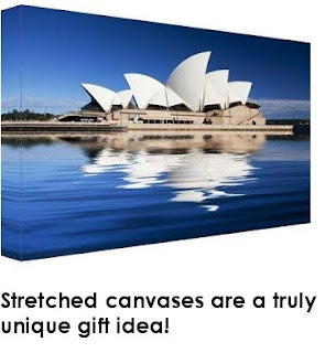
These pictures above are examples of digital prints. Anyone these days can create their own artwork and display it into their own home. You no longer have to purchase already taken photographs framed beautifully. Now with digital print making, anyone can display a digital photograph they have taken themselves with a digital print. They are created by copying a digital photograph onto a canvas or photograph paper with a laser that makes a crystal clear, sharpened image. It also allows one to manipulate whichever colors necessary, without disturbing other colors. Displaying the photograph on a stretched canvas takes the picture to a whole other level. I personally love the stretched canvas look. In homes, usually you will find many photographs framed in traditional different frames. Copying a photograph onto a stretched image adds a sleek, sophisticated, and modern look to the artwork. It can change the look of a room and add a touch of cleanness and artistic feel.


Wednesday, November 11, 2009

Robert Blake a Renaissance Freelance Designer


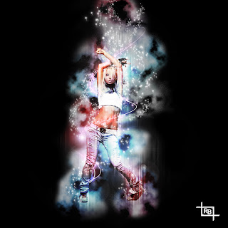
This design above was created by a freelance graphic designer named Roberto Blake. He is an example of a renaissance freelance designer because he is not just limited to one craft. He is also a photographer, digital artist, print designer, web designer, typographer, logo, layout, and branding designer as well. He said from a young age he was always interested in computer design so he wanted to become as educated and experienced in as many categories in creative design as possible. This shows that you do not have to be limited to one field. In college everyone is graduating to enter into only one focus into that career. As hard as the economy is, sometimes it is hard to get into the field that you want so you end up doing something similar to what you wanted. It is good to be familiar and have experience in more than one field like Roberto Blake. Being this diverse has many benefits especially if you are a freelance artist. It expands your networking, clients, and the ability to execute different aspects of projects. After reading his website and his portfolio he has opened my mind to other possible fields in new media. Being this adventurous outgoing in the different areas that you want to me makes the whole experience of being in a career not only hardworking, but more interesting and fun.
Images and source:http://robertoblake.com/

Tuesday, November 10, 2009

Publicity=Money


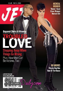
I am pretty sure everyone has heard of the domestic violence between singers and former couple, Chris Brown and Rihanna. On their way to the Grammy’s they were in an altercation. Chris Brown left Rihanna with cuts and bruises to her face over reasons not yet clear. This incident happened way back in the month of February. Now it is November we have seen recent TV appearances from both Rihanna and Chris Brown. Coincidently, they have both made TV interviews in the same month just a day apart. Both giving their side of the story and telling what they have learned from their incident. In both of their interviews they also seemed to mention their album release dates. They both are planned to be released this month of November, another coincidence. Although their altercation was more than likely not planned, it seems like the television appearances and the album release dates in the same time frame, were a publicized to gain more money. To me, this is an example of how when certain incidents happen with celebrities, they are publicized and it puts them more into the spotlight. More publicity and more spotlight equals more money for the media and the celebrity. For instance when the Paris Hilton’s sex tape was leaked, she has gotten multiple television shows since then and has remained in the spotlight. Brittany Spears and her drunken stunts of shaving her hair, her multiple times of brief marriages has earned her a reality show and big publicity of her new album. Another example recently is the sudden passing of Michael Jackson. Although his passing was tragic to his family as well as his fans, the media has used it in a way to make money. I am not saying that they are not honoring Michael Jackson by publicly displaying his work. But since then so many Michael Jackson albums, DVDs, apparel, magazines, newspapers, and other memorabilia have been sold. They are even auctioning off Michael Jackson’s personal possessions, like his white shiny glove. At the end of the day it all comes down to money. The Rihanna and Chris Brown incident have put them into the spotlight. Although Chris Brown’s career may not catch a break, Rihanna however, will probably get more views than ever and more views equal more money.

2012: Prophecy Exploitation


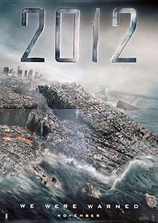
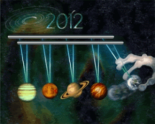
On November 13, 2009 nationwide, the premiere of 2012 will be making its way into theaters. This movie may be one of the most terrifying movies ever created only because it is predicted to be based on a factual event. For centuries predictions have risen revealing that the world of days as we know will finally be at its end. From oracles, the Bible, ancient calendars to the internet, they have all came to the same conclusion that the world will end. The Ancient Mayan calendar has accurately predicted 1000’s of years of events but suddenly ends on December 21, 2012. The Bible describes the series of events leading up to the apocalypse in the book of Revelations. The descriptions are similar to events that have effected out world in this new decade. In Ancient Rome many oracles such as Merlin (better known in famous fairy tales as Merlin the Wizard) has prophesized the day as well. Merlin was actually a human who was known to be half demon and he predicted descriptions similar to cell phones, tanks, nuclear wars, great floods, diseases, and death as signs to the end of the world. Ancient China has also recorded events that were transferred to a graph which surprisingly ends in the year of 2012. Something that has also made predictions is shockingly the World Wide Web. The Web-Bot Project was a program developed to use independent programs on the internet to predict future financial stock news. However, in the year of June 2001 it predicted something more than what it was meant to. It predicted that an event would change how we lived in the United States in 60-90 days. This is said to have been a prediction of the September 11th terrorist attacks. In 2012, the Web-Bot predicts of a destructive disaster in the line-up of our planet similarly to the Mayan Calendar prediction. Today we are in the year of 2009, going into 2010. We are stepping closer and closer to what these prophecies have communicated to us and because of that, the media is starting to pump up and exploit it. Releasing the movie 2012, two years before that date is not coincidental at all. Making a movie of factual predicted events so close to that time is pure genius because it is giving it alot of media exploitation. Showing the world the process of the Earth’s destruction is going to display a mixed feeling of emotions. It’s going to be exciting, scary, terrifying, interesting, and it also is going to make you think. Three years ago, people were not worried about the year of 2012, but since the movie and the media exploitations of that year, I think they will start to. It kind of reminds of Y2K. So many people were celebrating a new year into the millennium, however many were scared. The government was scared that computers were going to crash, people were stalking up food items in their house, and debates were going back and forth. When the millennium finally came, it was no different than any other New Years. In the end, the question is whether the year of 2012 being hyped up by the media to catch viewers or is there going to be truth to prophecies? That is for you to decide.

Thursday, November 5, 2009

Photography vs. Digital Photography


There are many different types of media technologies that have changed factors of the way we live, work, think, and even play. Artist and scientist have maintained to introduce such technologies such as radio, TV, film, photography, and animation to shape and obtain information. Up until today, technology over the years has evolved into what we would now call new media. For example, Past media such as traditional photography have developed into digital photography.The development of digital photography has converted it from its analogue traditional photography in many ways. Traditional photography was used as a chemical process on which a roll of film was used to snap photographs, depending on the light sensitivity, and processed through chemical development physically. Updated to digital, photography became more enhanced and precise. Unlike the traditional way, which only made a copy of the image, it transferred the image by using a binary code that a computer would understand. This convergence enabled the image to be stored in the camera itself; making it easier to access, manipulate, and in all, made users use their creative senses. It also made the camera easier to use and store memory through a computer. Traditional photography had limited capability, only allowing artist and users to copy a scene which could not be viewed until after it was copied. However, digital made photography easier to use only in the aspects of taking photos. But it improved so the possibilities of what to do with the image where endless. The only downfall from this transition of old media to new media is that now it does not take a professional to snap a quality photograph. Overall, scientific and artistic creations have made the use of reached its goal of making such technology superior and more user-friendly.


What Media Means to Me


Media to me means any type of technology that enhances our world, culturally, physically and mentally through a creative and/or scientific way.The experience that I have would be digital photography. I am forever snapping pictures anywhere and everywhere I go for memory sake. I love my digital camera it is so easy to use and everything on there is so convenient rather it be red eye removal, adjusting, it doesn’t matter. I can easily transfer my photographs to the computer and use them however I want. Lately the use of the camera has turned me on to using it professionally as well. I took photography once in high school and I have to say that you have to be a patient person to deal with use of dark rooms and developing your photograph manually, which I was not. I kind of wish I would have stuck with it and kept my camera because I think if I had been more patient, I would have appreciated old media a whole lot more as I do the new. Right now I am in CSCI-N241 Fundamentals of Web Development which we focus on HTML files. HTML stands for Hypertext Make up language but basically tells the browser how to display the page. So anyone who has a MySpace and is confused about what those little codes are to make your background; that is HTML files. Anyways I’m not a big expert on HTML yet, I haven't even gotten to the designing of pages because I am still on structure. However, it is something I would like to pursue because the overall look of web page is what determines if a person would actually take the time to look at the page, so that is one of my influences. Also no matter what, every business or company needs web pages on the internet. In the end hopefully I will be able to enhance my creative side in the field of web design.


Tim Burton: Original and Inventive


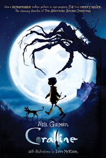
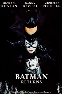
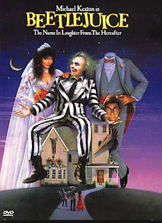
Having your own style when creating new media or anything for that matter, is a valuable trait to have. When you create something it is your idea and a piece of you goes into that project. When you add your own thoughts, experiences, or your imagination, it personalizes that work of art and that is what makes it unique. A person who can best describe this is none other than Tim Burton, producer, writer, and director. As a creative master-mind he has created many films some including, Edward Scissorhands, Beatle Juice, Batman Returns, The Nightmare Before Christmas, Sweeney Todd: The Demon Barber of Fleet Street, Coraline, and Sleepy Hollow, and 9. Tim Burton’s style is written all over each and every film because he creates a sense of eeriness, creepiness but magical dream world in all of his films. Each film has something in common with each other to where you can tell it is a Tim Burton movie. Today I was watching Batman Forever and I got an eerie vibe while watching it. Speaking out loud, I said it seemed like a Tim Burton film. But little did I know it actually was. Although his films all have something in common they are none of the less inventive, original, and creative. Tim Burton’s films may sometimes have the same characters, but each film offers something different. It seems that he has indeed made his theme in his craft strange, yet interesting, and magical. He is inspiring because it shows that when you stay true to yourself and what type of creative work you like doing it will be successful.

Images:
http://artfiles.art.com/images/-/edward-scissorhands-poster-c10060092.jpeg
http://michaelsmoviemania.files.wordpress.com/2007/10/beetlejuice.jpg
http://ociointernet.files.wordpress.com/2008/03/batman-returns.jpg
http://images.broadwayworld.com/upload/23004/tn-500_stonesheet.jpg
http://www.impawards.com/1993/posters/nightmare_before_christmas_ver6.jpg
http://ecx.images-amazon.com/images/I/51mYkbzs%2BrL.jpg
http://images.movieeye.com/store/images/sleepy-hollow-dvd.jpg
http://modernpost.files.wordpress.com/2009/05/9_poster.jpg


Yahoo or Google?


The layout of a website plays an important role in the use of that website. Although both are search engines and very popular websites, Yahoo and Google are totally different from each other. Yahoo’s layout is a very bold, bright and complex. When you first open up its webpage you see pictures, videos, news stories, games, graphics, email, and the box for the search engine. To some it is exciting, informative, and interesting. To others Yahoo is cluttered, unorganized, and has too much information. When you visit Google’s homepage it is organized with a few links at the top, just one picture, and the search box. Google website is considered organized, simple, and well thought out. However to some, Google’s layout is boring, too simplistic, and not as informative as Yahoo. The applications and links to both search engines are also very different. I think that the importance of an organized website is an important factor to a successful website. It helps to lead the eye from one direction to another and makes it more fast and effective. Yahoo, although contains a lot of information is too cluttered all on one page. It’s hard to follow from link to link because they are scattered everywhere with pictures and text. Google on the other hand is more broken apart and the information is arranged according to links. All the links are stationed at the top of the page and just one click on a certain category can take you to the information you want. When designing a webpage it is best to think about what is going to be easier on the audience to read and navigate through the page. If the website looks unorganized it could be confusing and irritating. Although Yahoo is still a popular search engine, it is not as successful as the simplistic yet efficient Google.

iPhones (touch screens) are not Invincible


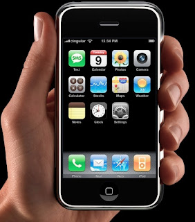
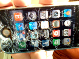
Touch screen cell phones were the newest and “coolest” technology when the iPhone was first introduced under AT&T. Then from there, it spread out world-wide reaching T-Mobile, Sprint, Verizon and other cell phone companies. With just one touch of your finger and a flick of a wrist, it enters you or takes you out any application on your phone. Before touch screens, in order to go from one application to another, you had to press one button to travel to that application and press it again to select it. But on the touch screen only one touch enables the application to open without using arrow keys to select the direction you want to go. This has made cell phone usage more interactive and playful. However, touch screens are more prone to freeze up or get damaged than phones that do not have touch screens. Last December, I went to an AT&T store to pick out a new phone. Once I told the sales associate I had an iPhone in mind, he gave me a few reviews about the iPhone from other customers. Many have called in complaining that their iPhones have frozen multiple amounts of times. Some other concerns were about the screen being too dark when a picture or video was in play. A couple of people have complaint about recent travels out of town and their iPhones crashed and all information had been lost. The last complaint I was told was the number of screen breakages. Many people drop their phones and minimum damages are made. Even I have dropped my phone and a scratch or two were made. But people who dropped their iPhones have cracked or even shattered their screens. I ended up choosing another touch screen. But even over time it has started to freeze up or open up applications on its own. In the end touch screens may be a more interactive phone. However with so much ability it offers you, you might find it getting worn out after it starts to freeze up or crash on you.

Image 1:http://www.techdigest.tv/apple-iphone-in-hand-thumb.jpg

Image 2:http://www.wired.com/images_blogs/gadgetlab/broken-iphone.jpg

Monday, November 2, 2009

The IMAX Theater Experience


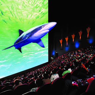
IMAX THEATER- the IMAX Theater is considered to be the world’s most immersive movie experience ever. It was founded in 1967 and the main headquarters is in New York and Toronto, Canada. The spacious cinematic theater, the layout, and quality of sounds and images give off a feeling of actually being in the scene itself. The layout of the screen is usually fully spaced from one end of the wall to the other and from ceiling to the floor. It is positioned in a way that caters to each and every audience’s field of view. The image quality projected is superior beyond any regular theater with digital surround sound systems that encloses you into the film itself. The IMAX audio system is featured to create a “real life” sound system. The technology used is designed so the audience member can determine where each and every sound is coming from and the clarity of sound creates a realistic feel. The screen is also designed to allow sound to travel through itself by thousands of holes in the screen. The IMAX allows movies shot in 2D and 3D to be experienced in its theaters. Even some movies that were only shot in 2D are shown 3D inside the IMAX. To experience a feeling of full immersion, the audience members are given 3-D glasses. One type is polarized glasses and the second type is a headset that has electronic liquid-crystal shutter (G. Mary Ruby. 2004 IMAX Corporation). The IMAX theaters can give a movie a whole different meaning. The movie immerses you and can also interact with you. The films featured in the theater range from popular blockbuster films to documentaries. Some of the films featured inside the IMAX have been, "The Dream is Alive," which the first IMAX premiere of a film that was shot in space. Others included; "Under the Sea 3D," "Voyage to the Alpha Planets," "Volcano," "Grand Canyon: The Hidden Secrets 3D", and "Titanica." Some of the popular blockbuster hits featured have been; "Apollo 13: The IMAX Experience," "The Polar Express," "Superman Returns: An IMAX 3D experience," "The Matrix Revolutions," and "Monsters vs. Aliens." Some of the films have been The "Dark Knight," "Watchmen," and "The Day the Earth Stood Still in IMAX." The most recent films being played are Michael Jacksons: This is It,” and Disney’s A Christmas Carol.”


Resident Evil


A video game that has been successful in being fun, entertaining, as well as scary is no other than Resident Evil. In the Resident Evil series, the origins of the zombie infected and mutated creatures are created by scientists that work for a big corporation called Umbrella. The Umbrella Corporation executed scientific experiments on humans, rats as well as other animals. The experimentation transformed the victims into monstrous blood thirsty creatures that eventually were unleashed into the world. The creatures were affected with different viruses, some being T- Virus and G-Virus. As the main character you walk through hell on Earth, watching your back for the blood thirsty creatures, not knowing if one is going to jump out on you. You can either play in third person which is over the shoulder. However, playing in first person immerses you more into the game because the zombie creatures are coming right at you. Resident Evil on the Wii is more interactive and immersive because it is played in first person. You do the all the actions to fight the zombies and dogs, and creatures off. When the creatures pop out of nowhere it dramatizes the game and makes it more heart-pounding and terrifying. When designing a video game that is meant to be terrifying you have to take some things into consideration. First you have to think of what scares people the most and will catch the audience’s attention to make them want to play the game. You also have to know what type of audience your game is geared towards and the regulations. Another thing to think about is what types of characters will interest the audience. Also what makes a game so immersive a player will not want to put the game down. Resident Evil is a game that has been a success in every possible feature necessary.